 |
 |
 |
 |
 |
 |
#422267 - 06/15/16 02:16 AM
 Arranger Control Surface Layout?
|

Junior Member
Registered: 02/25/16
Posts: 24
|
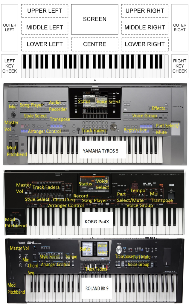
Hello, I currently use vArranger2 with an Edirol PCR800 MIDI Controller, a Novation Zero SL Mkii and a 17inch touch screen monitor. These work fine but the control surfaces don't have enough buttons, sliders, etc for vArranger. I have been thinking about constructing a hardware control surface for use with vArranger and I have looked at various manufacturer's arranger layouts such as Yamaha's Tyros5, Korg's Pa4X and Roland's BK9 to get an idea of what should go where. It appears that most have the arranger controls (start/stop/intro/variation/fills/endings) on the left lower section of the control surface. The style select is generally to the left and above the arranger controls Most have the voice group (piano, EP, Strings, brass etc) and part select/mute (upper 1,2,3 & lower) buttons on the right lower section of the control surface. Most voice selection is via touch screen or buttons alongside the right side of the screen. Some have the track faders in the front centre and some have them to the upper left. Song players are generally to the upper left but on some they are front and centre. The displays/screen are to the upper centre. My questions are: 1. what are the most commonly accessed controls by you, and 2. if you had your choice, where on the control surface (left, centre or right / upper, middle or lower) would you put the following: a. Arranger Controls b. Style Group Select c. Tempo controls d. Voice Group Select e. Part Voice Select (including part mute) f. Track faders g. Song Player controls h. Transpose/Octave controls i. Chord sequencer controls j. Other controls Here is the layout of the Yamaha, Korg and Roland boards. 
|
|
Top
|
|
|
|
|
 |
 |
 |
 |
 |
 |
 |
 |
 |
 |
 |
 |
#422288 - 06/15/16 10:19 PM
 Re: Arranger Control Surface Layout
[Re: MOMBOC]
|

Junior Member
Registered: 02/25/16
Posts: 24
|
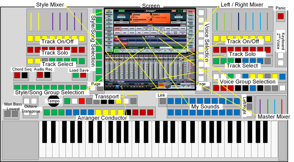
Here is my current plan for the layout of the control surface to operate vArranger. I have tried to place the most frequently accessed controls in the most convenient locations on the surface - but I would appreciate advice from other arranger users on how, where & why the layout could be improved.  The PC screen would be a 12.1" non-touch 800x600 unit which is located in the upper centre of the control surface. Arranger control/conductor buttons would be immediately available above the left hand side of the keyboard. Green for intros, blue for variation, yellow for fills, black for break and red for endings. Transport controls (Style Start/Stop, synchro, Fade In/Out, Chord Hold, Left Voice Hold etc) would be above the conductor. Tempo would be controlled by a rotary knob. Sound presets (My Sounds in vArranger) would be immediately available above the right hand side of the keyboard. (VArranger currently does not have external controllers to switch the Presets between Right, Left or Both - but this can be done on screen with a mouse). Voice Group selection buttons would be to the right. Group buttons are coloured to easily identify group types (e.g. white = pianos/keys, yellow = strings, red = brass etc Individual voices would be selected by vertical buttons down the right hand side of the screen. The screen labels change according to the selected Voice Group. Where there are more than 10 voices in a group, left & right buttons would enable the pages to be cycled through. Part/Track select buttons allow each track to be selected so that the individual voice can be assigned. (At this stage vArranger only allows external controllers to directly select the Right1 or Left1 part - others are selected with a left/right scroll button - or on screen with a mouse). Style Group selection buttons would be to the left. Individual styles would be selected by vertical buttons down the left hand side of the screen. The screen labels change according to the selected style Group. Where there are more than 10 styles in a group, left & right buttons would enable the pages to be cycled through. The mixer strip is split. Right/Left played voice faders (Right 1,2,3,4, 2nd Voice, Left 1,2,3)are on the right hand upper side of the surface. Buttons enable each part/track to be soloed or muted. The Style part/track faders (Drums, Perc, Bass, Accomp 1,2,3,4,5) are on the upper left of the surface. Buttons enable each part/track to be soloed or muted. The Master Mixer (which allows balancing the combined accompaniment, combined left voices and combined right voices plus the Master Volume is to the right of the My Sounds presets. Other functions such as the Chord Sequence Recorder, Audio Recorder, Song Load/Save, Octave shift, Transpose, Manual Bass, Full Keyboard mode, panic etc) are placed to be accessible. Your thoughts?
Edited by MOMBOC (06/15/16 10:46 PM)
|
|
Top
|
|
|
|
|
 |
 |
 |
 |
 |
 |
 |
 |
 |
 |
 |
 |
#422593 - 06/26/16 11:26 PM
 Re: Arranger Control Surface Layout
[Re: MOMBOC]
|

Junior Member
Registered: 02/25/16
Posts: 24
|
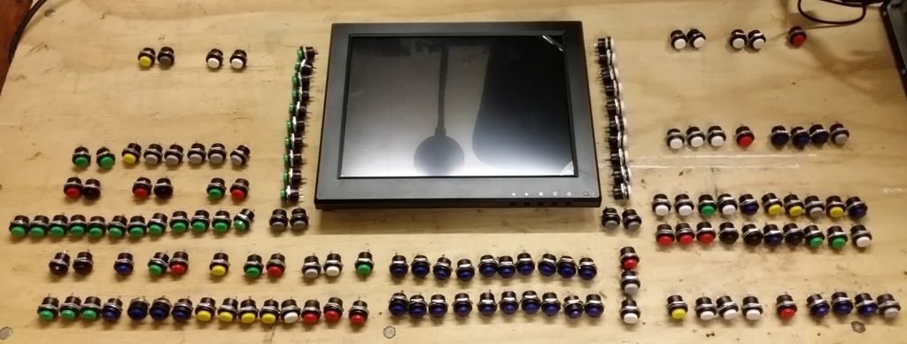
Just starting to receive and layout some components for the first prototype of my vArranger hardware control surface Compared to the diagram in my previous post, I have: * deleted the right & left Track Solo buttons, * deleted the Accompaniment Track/Part select row of buttons * located the row of Right/Left Track/Part Select buttons below the Voice Group select * added a yellow button to the Right/Left Track/Part select row for selecting the Bass Track/Part * chosen some different colours for the buttons. The workflow for selecting a voice would be: 1. on the bottom right row - select the Track/Part to which the voice is to be assigned, 2. select the Voice Group (in the next rows of buttons above the Track/Part select) 3. select the individual voice (to the right of the screen)  The screen is 12.1 inches across the diagonal and has 800x600 resolution. It is non-touch. The push buttons are momentary action and are not illuminated. I'm still waiting for other parts to arrive.
|
|
Top
|
|
|
|
|
 |
 |
 |
 |
 |
 |
 |
 |
 |
 |
 |
 |
#422643 - 06/28/16 02:09 AM
 Re: Arranger Control Surface Layout
[Re: MOMBOC]
|

Junior Member
Registered: 02/25/16
Posts: 24
|
@ Dan
Thank you for your observations and comments.
I do have electronics skills. I have MIDIfied several large Organ consoles for use as virtual organs with Hauptwerk.
This version of the control surface is my cheap mock-up prototype. Once I am satsified with what I what to include and where I want to place it I will build a 'production' model
I agree that a touch screen or a 2 in 1 PC/Tablet that can drive the system would be a good approach. The cheap 12.1 inch display I have obtained is about the same width as a Microsoft Surface Pro 4 but it a little taller.
At this stage I think that a 4:3 screen aspect ratio is OK but 800x600 is not high enough resolution to show enough text on the vArranger on-screen buttons etc. I'll have a look around at the cheap open frame LCD touch screens but they tend to be only 800x600 pixels.
I also agree that illuminated buttons, synchronised to vArranger, would provide a much better view of the status of the software. I will use lit buttons on my final version but I just wanted to use the standard push buttons on the first propotype to get a feel for where each button should be and to work out the layout.
The buttons use a 16mm hole, so a spacing of one per 20 or so millimetres will probably be a suitable density.
If I reintroduce a Track Solo control then I think that I would only have one button for Soloing the Right1 voice.
I will be using a commercial MIDI encoder - not building/developing my own from an Arduino etc
Thank you for your offer to add missing controllers. Once I have settled on a final design I will let you know what I need. At this stage I'm quite sure that I will need:
* the Left 1,2,3; Right 1,2,3&4; 2nd voice and Bass Track Select controllers
- on the photo these are the nine buttons (1xyellow [Bass], 3xwhite [Left1,2,3], Red [Right1] 3xblue [Right2,3,4] and 1xgrey [2ndVoice]) on the bottom right of the picture above
* the ability to use buttons to select Right, Both or Left for the 'My Sounds' section
- on the photo these are the three vertical buttons (red, grey and white) to the right of the 20 Blue My Sounds buttons
|
|
Top
|
|
|
|
|
 |
 |
 |
 |
 |
 |
 |
 |
 |
 |
 |
 |
#423431 - 07/14/16 11:43 PM
 Re: Arranger Control Surface Layout?
[Re: MOMBOC]
|

Junior Member
Registered: 02/25/16
Posts: 24
|
A few more parts have arrived. I'm trying to settle on the final layout for the prototype before I start cutting and drilling some sheet metal. Here is the current button layout, with faders and drawbars added. In this arrangement I have stacked the arranger controls into two rows, with the Fill buttons (4 x yellow) directly above the corresponding Variation buttons (4 x blue). The Break, Sync Start, Sync Stop, Fade In/Out, Chord Hold and Left Hold buttons are also in this second row I have moved the Ending buttons (3 x red) over to the left, next to the Intro buttons (3 x green)  Overall dimensions of the control surface to accommodate all of the components are 1100mm x 310mm - without keyboards. I'll need four panels: 1 - for the arranger controls, presets and drawbar base (bottom) 2 - for the screen and individual style and voice selection buttons (centre - tilted on an angle) 3 - for the style group buttons and style faders etc (left side, raised up and slightly tilted) 4 - for the part select, voice group, voice/part faders and master faders (right side, raised up and sightly tilted - to allow the drawbar arms to move underneath)
|
|
Top
|
|
|
|
|
 |
 |
 |
 |
 |
 |
 |
 |
 |
 |
 |
 |
#423604 - 07/19/16 07:39 AM
 Re: Arranger Control Surface Layout?
[Re: MOMBOC]
|

Senior Member
Registered: 08/09/01
Posts: 1134
Loc: FRANCE
|
|
|
Top
|
|
|
|
|
 |
 |
 |
 |
 |
 |
|
|

